

-
The logo, in blue and green, is a full embodiment of internationalization and professionalization of our company.
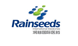
- The logo evolves from the basic form of Chinese characters “润” and “心”. The nine water drop patterns are derived from three of the left component of the character “润”, interpreting the “graphic” psychological image of the character “润” in the brand name, which is moisten all living creatures on the earth and make them warm, humid and glossy. It conveys the philosophy “The ponding becomes a deep pool”, and then calls to mind the old Chinese saying “The ocean can hold hundreds of rivers while a great man can tolerate many things”. The diverse changes are all based on the nine dots. Besides, in Chinese traditional mathematics, “Nine” is the biggest figure, representing complete, rich and immense and symbolizing the infinite space of corporate development; there are four dots at the right bottom, every two dots blend with each other. Together with the above two dots, they form the shape of two persons, representing the operating principles of “reciprocity, cooperation, and people-oriented”.


